UX in Practice
Good UX Leaves a Paper Trail
The case studies on this page were led by the UX team I built and managed. My role was to set the strategic direction, create the conditions for rigorous research and testing, and ensure the work was grounded in user needs and business outcomes. These three studies are representative of how that team operated: hypothesis-driven, data-informed, and focused on impact.
82% Less Time: Rostering for Admins
The Problem
Rostering, the process of connecting students, teachers, and classes at the start of each school year, had quietly grown into one of the most frustrating experiences for our district administrators, consuming an average of 17 days to complete. Bulk imports threw cryptic errors that took hours to diagnose, there was no way to view or edit individual students outside of a full re-import, and the interface gave admins little visibility into whether their roster was actually complete. This all created a heavy reliance on Customer Success and Implementation teams to get districts up and running.
The Approach
The team conducted user interviews, usability testing, and workflow audits with administrators from districts of varying sizes. The data unearthed four core improvements: smarter error handling for bulk imports (and allow for inline corrections), visual conflict indicators showing license allocation at a glance, manual editing capability for individual student records, and automated tools for replacing teachers or administrators without blowing up student progress.
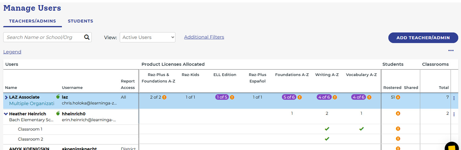
The Results
Time to complete a full district roster dropped from 17 days to 3 days — an 82% reduction. Editing time decreased as well, and Customer Success and Implementation calls related to rostering dropped significantly, freeing internal resources and reducing friction for administrators at the start of every school year.
25% Lift: Trial Conversions
The logged-in homepage for trial users was indistinguishable from the marketing page non-subscribers saw. It was crowded, with too many elements competing for attention, and gave new users no clear sense of where to start. User feedback was consistent: teachers who had just gained access to the platform didn't know what to do next, couldn't find what they were looking for, and weren't connecting with the resources most relevant to their needs. Product and Marketing believed the page was already optimized, but our research suggested otherwise.The Approach
The team used search behavior data to identify what users were actually looking for, then built the hypothesis that if the homepage surfaced resources aligned with real user intent, engagement and conversion would follow. One insight stood out: decodable books surfaced unprompted in over 80% of user research sessions, even in studies about unrelated topics. The team built a low-effort prototype, usability tested it with real users, and presented the data to the (skeptical) product team. The redesign streamlined the layout, added personalized callouts, and surfaced the resources users were genuinely seeking.
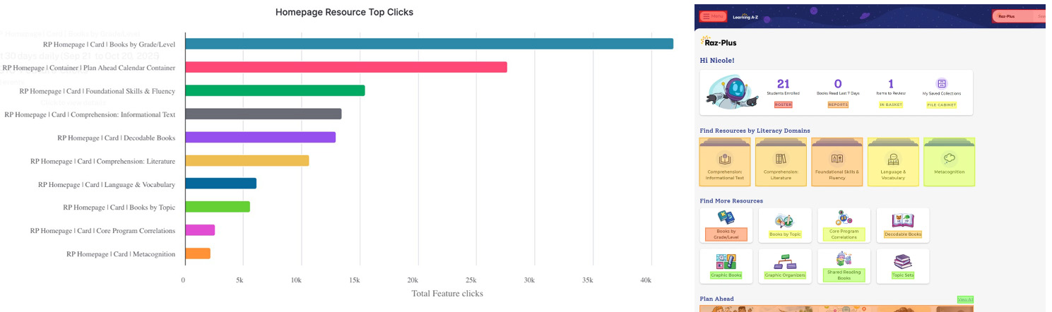
The Results
Trial conversions increased by 25%. "Suggested resource" cards ranked first, second, and fifth among all fifteen cards on the page. Even a seasonal planning section placed below the fold came in second by a wide margin, validating our instinct that relevant content trumped placement. The project became a nice internal proof point for the power of search intent data in product decisions.
$290K: Shopping Cart Improvements
The Problem
Analytics and user feedback revealed significant drop-off at two points in the purchase funnel: the login page and the shopping cart. The login forced users through a confusing set of radio buttons that didn't follow common e-commerce mental models and created brand recognition confusion between product and company. The shopping cart compounded the problem with non-standard UI patterns, a visual hierarchy that pulled attention toward discount codes rather than checkout, and a screen cluttered with disabled products.
The Approach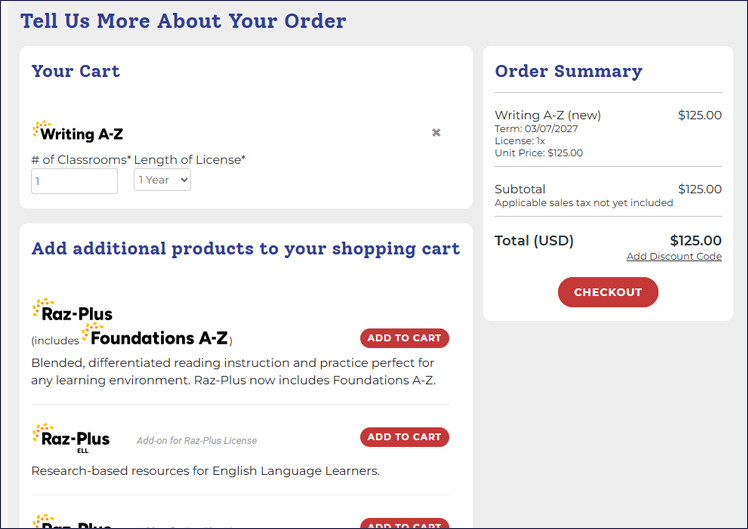 The team applied e-commerce best practices and common mental models throughout. The login was redesigned to match patterns users encounter on familiar e-commerce sites, reducing confusion and duplicate account creation. The shopping cart was rebuilt with standard add and remove interactions, a visual hierarchy that led with checkout, and a cleaner layout that removed distractions without removing functionality.
The Results
Conversion rate increased by 17% in the quarter following launch, exceeding the 15% goal. That translated to $292,000 in additional revenue for the quarter. As a bonus, duplicate account calls and consolidations to Customer Success dropped as well, a secondary benefit the redesign hadn't explicitly targeted.
UX as a Strategic Driver
These studies were part of a broader effort to reposition UX from a production function to a strategic partner. That shift required building a team with strong research capabilities and the business fluency to contribute to decisions earlier in the process, as opposed to simply carrying them out later. Over time, the role of UX began to change. When the team could walk into a conversation with data, a clear point of view, and a tested prototype, they were no longer seen as a service layer. They became an active driver of product direction and, ultimately, a source of competitive advantage.